 |

art gallery
class info
projects
resume
travel
webmaster
portal
|
|
|
8 |
9 |
10 |
11 |
12 |
13 |
14 |
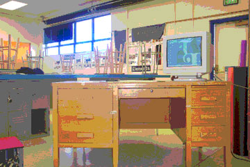
 Kate Bagby, Work Site.
2004, Cuba, NM, 300 X 200 pixels.
The filter assignment. The original I worked with is the same one I used for my banner.
I chose it because it is personal and has lots of color. Color seems a necessary ingredient for putting images through the filter.
|
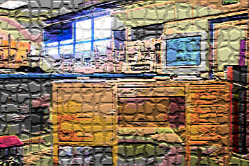
 Kate Bagby, Work Site. 2004, Cuba, NM, 300 X 200 pixels.
Choosing "texture" under the filter menu, I chose mosaic. The image held together on this one and the texture takes it to a higher level of interest.
|
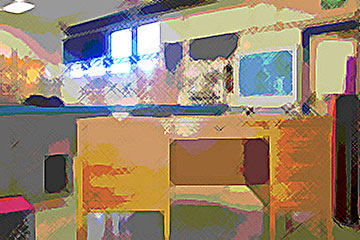
 Kate Bagby,
Work Site. 2004, Cuba, NM, 300 X 200 pixels.
The "crosshatch" filter is under Brush Strokes. I think the softness is beautiful. Of course, in art class, students learn cross-hatching.
I will use this image and the others for instruction during the school year.
|
 Kate Bagby, Work Site. 2004, Cuba, NM, 300 X 200 pixels. Here is one that surprized me. Believe it or not, this is colored pencil. I found it under "Artistic." How do the people at Adobe name these things? |
|

